| 索引 |
| BeOS 位图图标 VS Haiku 矢量图标 图标属性 创建图标 路径 模型 格式 压缩工具 保存图标 提示与技巧 |
 图标套件
图标套件
| 桌面栏: | ||
| 位置: | /boot/system/apps/Icon-O-Matic | |
| 设置: | ~/config/settings/Icon-O-Matic |
在正式开始使用图标套件创建图标之前,我们需要了解一些有关 Haiku 图标的基本信息。
 位图图标 VS 矢量图标
与 BeOS 不同,Haiku 使用矢量图标而非点阵图标。Haiku 项目已经开发了一种特殊的矢量图标格式(HVIF),并且对文件大小和快速渲染做了充分的优化。这就是我们的大部分图标所占的空间要比点阵图标和常用的 SVG 格式图标小 非常多 的原因。同时,和 BeOS 的点阵图标不同,Haiku 图标并没有限制于 8 位的调色板(256 色)。
以下面的终端图标为例:
| 点阵图标 | SVG | HVIF |
| 1,024 字节 + 256 字节 | 7,192 字节 | 768 字节 |
Note that the BeOS used two versions of an icon, one 16x16 and one 32x32, to achieve good visuals in List and Icon View mode.
矢量图标则无需这种技巧。它们除了仅需使用几百字节的空间,而且缩放效果也要比点阵图标好很多。(注意:BeOS 仅提供了16x16 和 32x32 两种图标。)
| 16x16 | 32x32 | 64x64 | 128x128 | |
| 点阵图标 |  |
 | ||
| 矢量图标 |  |
 |
 图标属性
图标属性
图标保存为相应文件的属性。但是,这也并不意味着,每个文件都必须具有该属性,并在文件浏览器窗口中显示为图标:数据文件从其文件类型继承图标。您可以使用 文件类型 首选项全局修改文件类型的图标。如果您只希望为单个文件添加图标,您可以使用其中的 文件类型附加组件。更多信息请查阅 文件类型。
 创建图标
创建图标
图标套件是 Haiku 的图标编辑工具,它允许您将作品保存成为 HVIF,SVG 或者 PNG 格式。图标也可以直接附属为某个文件的属性,或者导出为程序员可以使用的资源和源文件。因为应用程序可以剪裁为优化的 HVIF 格式,它的使用也反映了该格式的内部情况。
Other than your normal vector graphics software, you don't deal with separate objects that each include all their specific properties like path, stroke width, stroke and fill color etc. Rather, you assemble your objects ("shapes") from shared paths and colors ("styles") and set certain properties. This re-using of elements is one secret of HVIF's efficiency. Although that imposes some constraints on the icon designer, there are a few advantages, too.
For example, by re-using a path, several objects can be modified together by manipulating this one path. Think of an object and its shadow. Modifying their shared path will change the object itself and automatically its (maybe slightly distorted/translated) shadow.
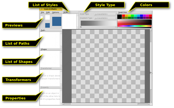
下面是 图标套件 窗口的预览截图:

To create any visible object on the canvas, you need a shape with a path and a style. Conveniently, you can create one, two or all three of those together from the menu. Every kind of object (Paths, Shapes, Transformers, and Styles) has a menu above its list of elements, offering various commands. Every element has certain options that are set in the view.
 路径
路径
A path consists of several points which are connected with lines or Bezier curves. To add or change points, make sure the path is selected in the path list.
Simply clicking in the canvas will set the first point. While setting a point, you decide if the resulting line will be straight or curved: a simple click and release produces a straight line, holding down the mouse button and moving the mouse will drag out the handles for a Bezier curve. Of course, you can also change it all later on.

To get from "A" to "B", you have to transform some points from corner-points to curve-points. That's done by holding ALT while clicking on a point and dragging out the handles. This results in a symmetrical Bezier: the second handle follows the movement of the other. If you need to move the handles independently, again click&drag on a Bezier handle while holding ALT.
Vice versa, to go from Bezier to a corner-point, hold ALT and click on a point.
To move a point, simply click&drag it. To select more than one point, hold down SHIFT and draw a selection rectangle. Selected points are marked with a red border instead of the usual black.
To insert a point into a path you click on the connecting line between two points.
Selected points are deleted by pressing DEL or by clicking on any point while holding CTRL.
鼠标指针指示栏了当前模式:
| 移动点 | 插入点 | 添加点 | 删除点 CTRL |
平滑曲线 ALT |
选择点 SHIFT |
您可以通过右键点击某个点或选中点打开一个上下文菜单:
| ALT A | 选中当前路径中的所有点。 | |
| T | 将所有选中点放置于转换框,这样您可以集中对它们进行移动,自定义大小和旋转。它和模型的运行相似,它将会在下面的内容中讲到。 | |
| 将选中点分割为二,两者重叠放置。 | ||
| 将选中点旋转 180°。仅对贝塞尔曲线点有效。 | ||
| DEL | 删除选中点。 |
路径菜单
The menu offers a few obvious entries to and or to or a path. Here are some that may need a bit more explaining:
| If your path isn't "closed" (see Path Properties below), a click into the canvas always creates a new point, connecting it with the last one. "Reverse" will reverse this order and your new point will connect to original start point instead. | ||
| Most useful with imported SVGs, this function will remove redundant points. | ||
| ALT R | Practically, this rotates the opening of a path. It's best seen when using a not-closed path with a style and a shape with a stroke transformer. Now, if your path looks like a ⊂ it will rotate like this: ⊂ ∩ ⊃ ∪. | |
| ALT SHIFT R | Does the same in the other direction. |
路径属性
at the bottom left of the window offers all available settings of the currently selected object. A path only has two: a and if it's or not.
 模型
模型
A shape groups together one or more paths with a style. Practically, it's the object that you'll actually see on the canvas. The grouping is done with the checkboxes in front of the paths and styles: Just select your shape and tick off the desired path(s) and a style.
A shape defines how a path and style is applied, e.g. if the object is filled or only stroked (which is done by using Transformers on the shape, we'll get to that later). Also, a shape can be moved, rotated or resized without touching the used path. That way, you can re-use a single path and get different, but related, shapes.

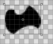
When a shape is selected from the list, a rectangle is drawn around it. Depending on where exactly you grab it, the shape is moved, resized or rotated around a point in its center, which itself can be moved. Holding SHIFT will lock direction when moving, limit rotating to 45° angles and restrict the aspect ratio while resizing. The mouse pointer again indicates the current mode:
| 移动 | 定义大小 | 旋转 | 移动 旋转点 |
Shapes lie on top of each other, each is on its own layer, if you will. To reorder them you drag&drop their entry to a different position in the list.
模型菜单
The menu offers the before mentioned possibility to and to or a shape. Then, there is:
| Reverts all the move, resize and rotate transformations you have applied to the shape. | ||
| When you transform a shape, its assigned path(s) stay in their original position. This may be intended; maybe more than one shape is using that path, maybe you intentionally used to set the points at precise pixel borders. If not, "Freeze Transformation" will apply the current shape transformation to the assigned path(s). A future "Reset Transformation" will then return to this new state. |
模型属性
除了,模型的视图还有以下选项:
| Minimum Level of Detail | ||
| Maximum Level of Detail |
Level of Detail (LOD)
| 16x16 | 32x32 | 64x64 |
See how there are no numbers in the 16px version of the BeVexed icon? That's done with the "Level of Detail" setting of their shapes.
With the LOD you control the visibility of a shape depending on its size. That way, you can leave away details of an icon that look good on a bigger icon, but maybe not so much on its smaller version.
This is how it works: A LOD of 1.0 is defined as a 64px icon size. To get the LOD of a particular icon size you simply divide it by 64, e.g. a 16px icon has a LOD of 16/64 = 0.25. A shape won't be visible below its and above its .
So, if you set a shape's to 0.0 and the to 0.5, this means that the shape will only be visible for icon sizes smaller or equal to 32px. If you wanted to exclude the 32px icon size, you'd have to stay below 0.5, say 0.49.
The LOD is not only for leaving out detailing shapes, but also to e.g. change the stroke width at different sizes, if you feel that's needed. Simply duplicate a shape, make your changes and set both of their LOD settings to show either one or the other. Here lies the only source of potential confusion, when you unwittingly overlap LODs of shapes, and wonder why at some size both are visible...
For example, if Shape 1 were to be shown below 48px and Shape 2 from 48px upward (LOD: 48/64 = 0.75):
| OK | Not OK! | ||||
| 模型 1 | Min LOD | 0.00 | Min LOD | 0.00 | |
| Max LOD | 0.74 | Max LOD | 0.75 | ||
| 模型 2 | Min LOD | 0.75 | Min LOD | 0.75 | |
| Max LOD | 4.00 | Max LOD | 4.00 | ||
 类型
类型
A style can either be a solid color or some type of gradient.
Besides the predefined colors under , you can mix your own by clicking on the current color. Also, note the slider under the color spectrum which sets the alpha-channel (transparency).

You quickly create a new style by mixing your color and simply drag&dropping it into the list of styles.
If you go for a gradient, you set the type (, , , ) and then define the start and end colors. This is done with a drag&drop from a color bucket into the respective color indicator under the gradient.
Of course you can move these indicators to change the gradient to your liking. You can also insert more indicators to add more colors by double-clicking into the gradient. Pressing DEL removes the selected indicator.
You can move, resize and rotate the representing box of a gradient on the canvas until it fits your needs. This works just like with shapes.
类型菜单
The menu offers the usual entries to , or a style and to .
类型属性
是 类型仅有的一个。
 压缩工具
压缩工具
A shape can have Transformers which change its appearance. The effects, however, are more subtle than a truck turning into a battle robot...
Transformer Add Menu
| Adds an outline to a shape. | ||
| Strokes the path of a shape instead of filling it with a style. |
Depending on the kind of Transformer, you'll get a different set of properties.
Transformer Properties
Besides a and the actual for the transformer, the view has these (depending on its type slightly differing) options:
| Stroke only. Defines the end caps of a line: , or . | ||
| Contour only. Determines if the contour is to the inside or outside the path. | ||
| Defines how lines are joint at a point: , or . | ||
| Only when the above is set to "Miter" this setting influences the looks of the miter joint. |
 保存图标
保存图标
There's your usual menu bar at the top, , , . The usage is pretty much self-explaining, so we'll only look at how to save your work.
will save in a special Icon-O-Matic format that retains additional information like the names of paths, shapes and styles. These will be stripped from the actual icon once you export it to save space. It's a good idea to back-up your work like this, because without named objects everything's named "<path>/<shape>/<style>" which makes specific changes tedious.
opens a familiar save panel with a file format pop-up menu at the bottom, offering these choices:
| HVIF | Haiku 矢量图标格式 | |
| HVIF RDef | 保存为程序员使用的资源 | |
| HVIF Source Code | 保存为程序员使用的源代码。 | |
| SVG | 保存为 SVG | |
| PNG | 保存为 64 像素 PNG | |
| PNG Set | 保存为 16,32 和 64 像素 PNG | |
| BEOS:ICON Attribute | 选择文件并直接设置其图标属性 | |
| META:ICON Attribute | 选择文件并将鼠标附加为元数据 |
 提示与技巧
提示与技巧
在使用图标套件时,您需要注意一些东西,还有一些常用的使用提示:
阅读 图标指南,学习 Haiku 图标的重要特性,如,透视,色彩,以及阴影。
您需要总是尽量少使用路径,它们非常占用空间。尽量多的重用路径,并且精巧的处理模型及其变体。合理的利用渐变也可以节省空间。
Wherever possible, you should activate Snap-to-Grid from the menu when editing paths. Path points that align with the 64x64 pixel grid use less storage space. You'll also get the crispest look if points are set on exact pixel borders. For example, it is important to align the most prominent outlines with the 16x16 grid.
Check the preview to see if your icon still looks good in 16x16. You may want to use the Level Of Detail settings described in the Shapes section.
There's an easy way to produce letters, even if Icon-O-Matic doesn't provide such a tool. Just enter the text in a text editor such as StyledEdit, adjust font type and style, and drag&drop or copy&paste the selected text into Icon-O-Matic. This will create the according paths and shapes.
If you assign more than one path to a shape, their overlapping areas will cancel each other out. When one path is completely inside another, it practically creates a hole in the resulting shape.
You can zoom in and out of the canvas with the mouse wheel. Panning is done either by click&drag with the middle mouse button or with a normal left-click&drag while holding SPACE.
 中文 [中文]
 Français
 Deutsch
 Italiano
 Русский
 Español
 Svenska
 日本語
日本語 Українська
 Português
 English